Location Breda di Piave (TV)
Year 2022
Designer AMAA, Arch. Marcello Galiotto PhD, Arch. Alessandra Rampazzo PhD
Team Arch. Serena Bolzan, Arch. Lucia Corti, Arch. Gian Luca Perissinotto, Geom. Francesco Toson, Eng. Riccardo Marchetto
Client Fabric 12 di Agostino Bruscagnin & C.
Photography Simone Bossi
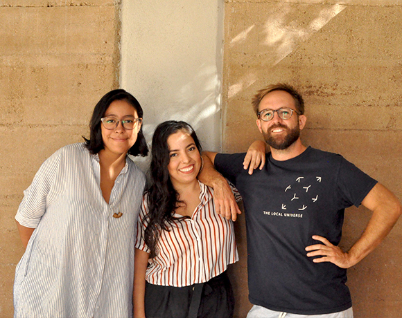
HET
Towards a Grounded Elegance
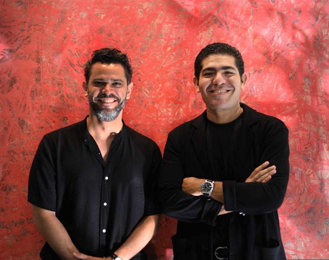
Lavalle Peniche
A Process of Constant Evolution
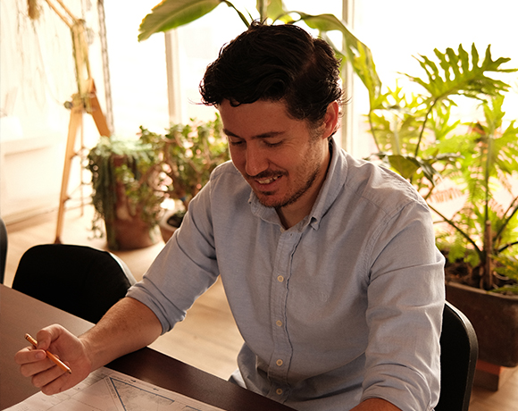
MGGA
Reflective design, resilient practice
VOID STUDIO
Historical Roots in Contemporary Spaces
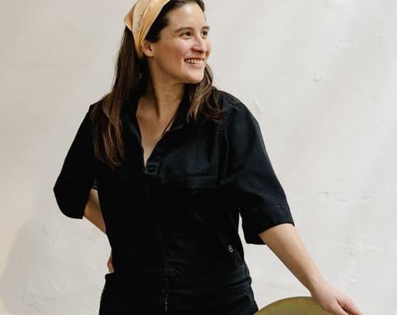
MANUFACTURA
Reclaiming Design Through
Heritage and Technology
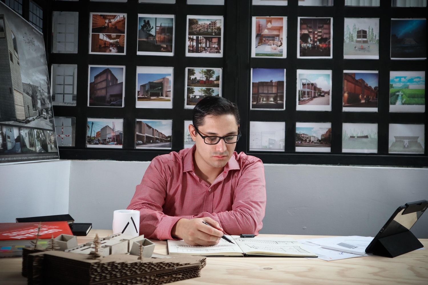
WIDO
Democratising spaces
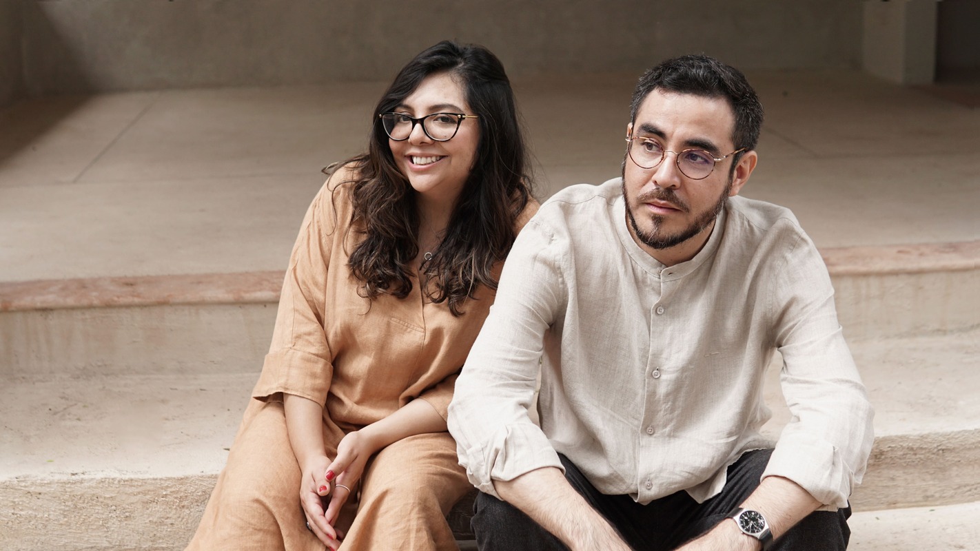
FMT
Ethical Spaces with Enriched Lives
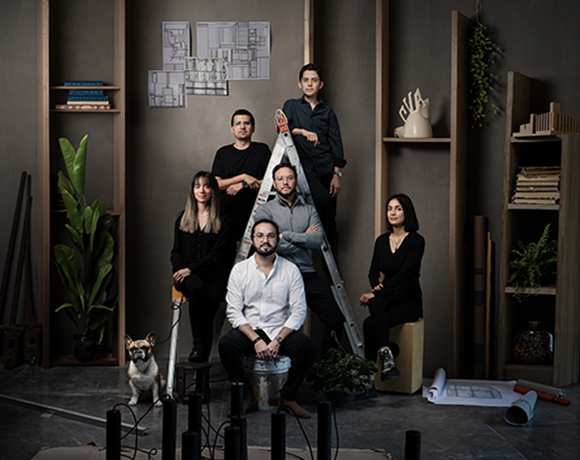
Dosorozco
Handcrafted Harmony in Design

MOG+
Rural Essence Brought to Modern Design
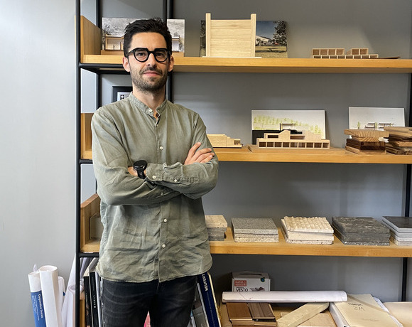
Morari
Deliberate Design with Thoughtful Execution
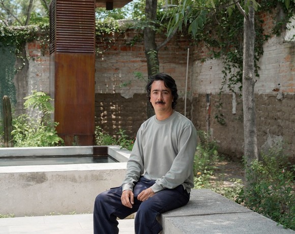
Taller BAC
Native Landscapes
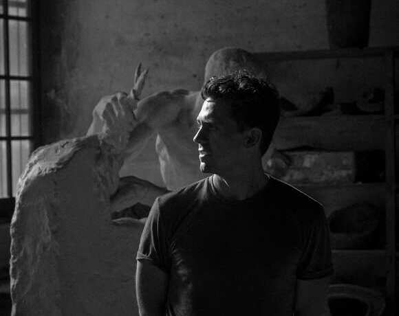
Practica Arquitectura
Creative Convergence in Practice
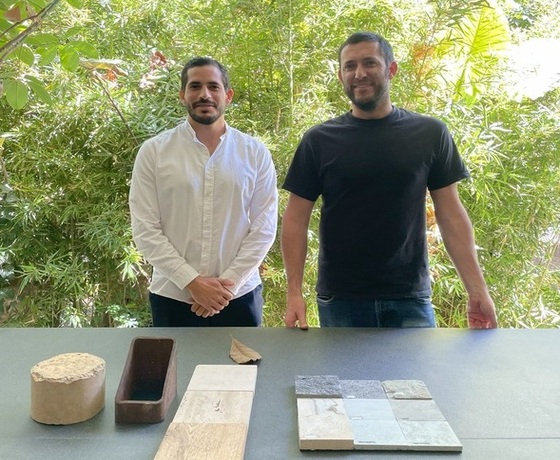
V Taller
Towards a harmonious practice
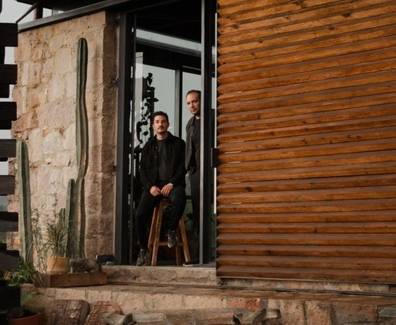
3 M E
Identity, Territory, Culture
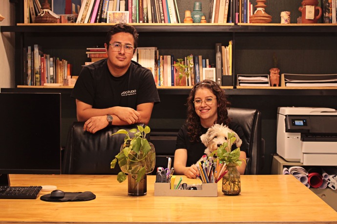
GRADO
Learning from the local

MATERIA
Blending Integrity with Innovation
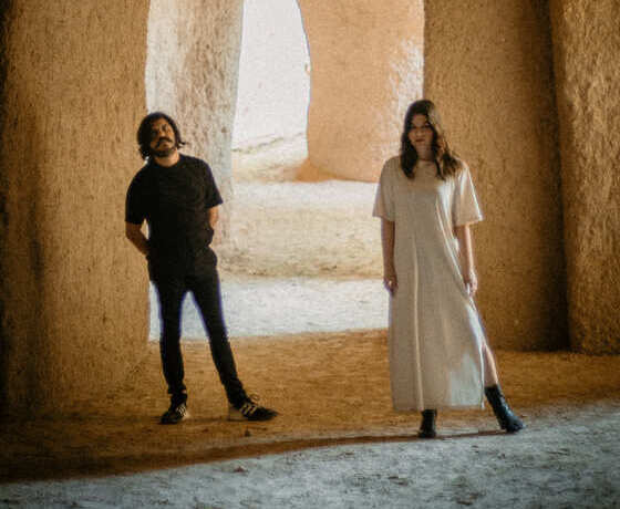
BARBAPIÑA Arquitectos
Designing for a sense of belonging
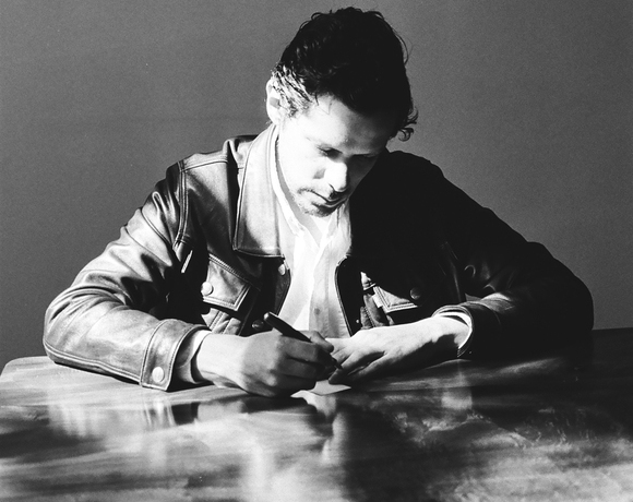
[labor_art:orium]
Architecture rooted in emotion, functionality,
and truth
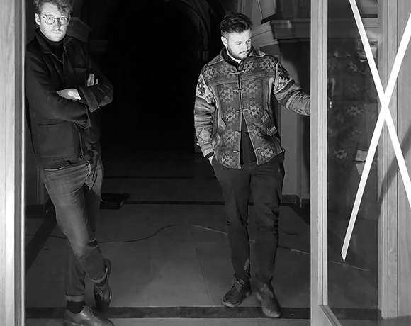
OBVdS Workshops
Fostering a Dialogue-Driven Adaptability
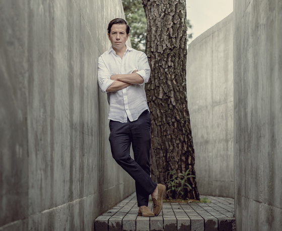
HW Studio
Designing Spaces with Emotional Depth
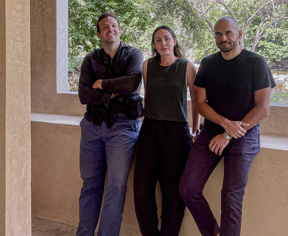
MAstudio
Building Authentically, Impacting Lives
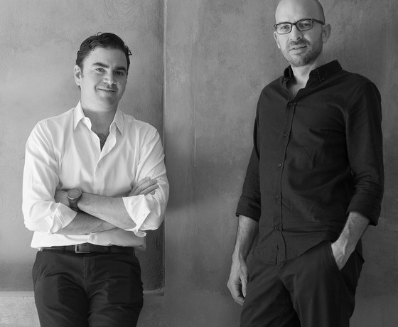
JDEstudio
Stories Behind the Structures
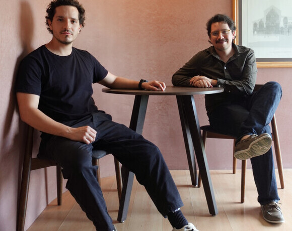
TAH
From Constraints
to Opportunities
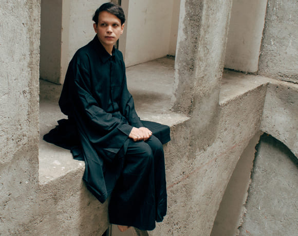
Inca Hernandez
Shaping a Timeless
Future for Design
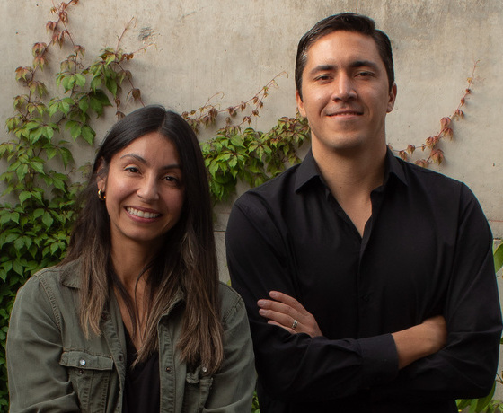
TORU Arquitectos
A dynamic duo
blending bold visions
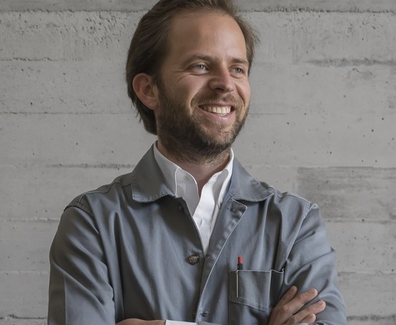
Estudio AMA
Redefining Narrative
Driven spaces
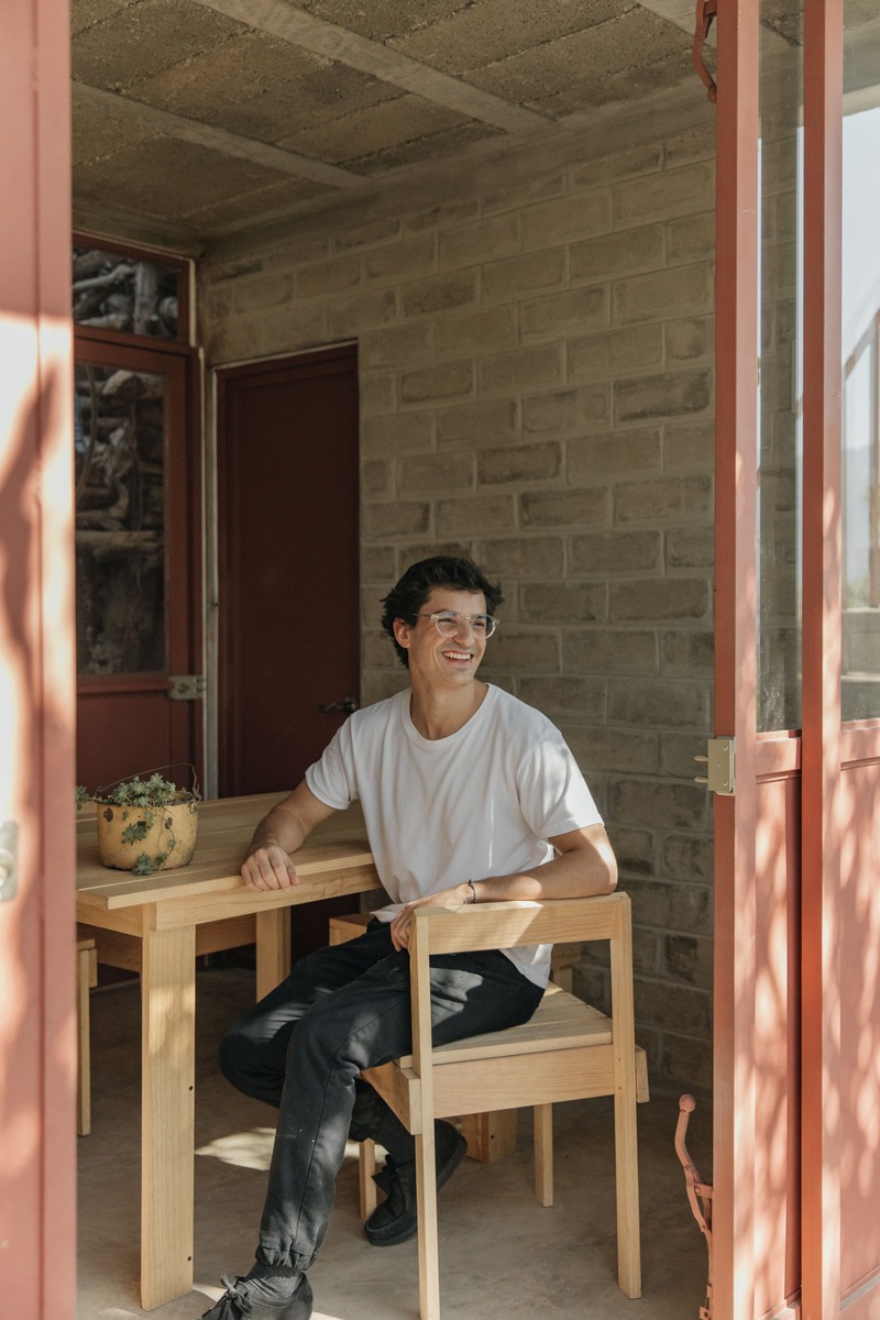
NASO
Designing for Change
and Growth
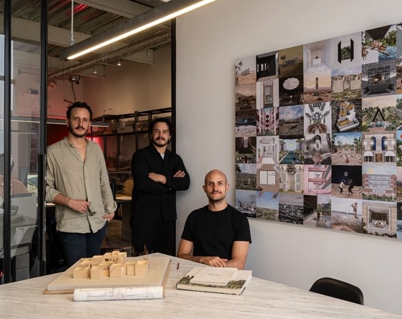
RA!
Global Influences,
Localised Innovations
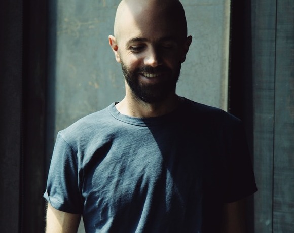
MRD
Embracing local context
and community
Fill this form to have the opportunity to join the New Generations platform: submissions will be reviewed on a daily-basis, and the most innovative practices will have the chance to be part of the media's coverage and participate in our cultural agenda, including events, research projects, workshops, exhibitions and publications.
What is your name or office's name?
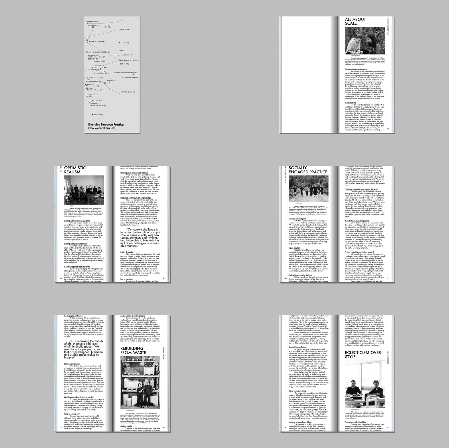
New Generations is a European platform that investigates the changes in the architectural profession ever since the economic crisis of 2008. We analyse the most innovative emerging practices at the European level, providing a new space for the exchange of knowledge and confrontation, theory, and production.
Since 2013, we have involved more than 3.000 practices from more than 50 countries in our cultural agenda, such as festivals, exhibitions, open calls, video-interviews, workshops, and experimental formats. We aim to offer a unique space where emerging architects could meet, exchange ideas, get inspired, and collaborate.
A project by Itinerant Office
Within the cultural agenda of New Generations
Editor in chief Gianpiero Venturini
Team Akshid Rajendran, Ilaria Donadel, Bianca Grilli
If you have any questions, need further information, if you'd like to share with us a job offer, or just want to say hello please, don't hesitate to contact us by filling up this form. If you are interested in becoming part of the New Generations network, please fill in the specific survey at the 'join the platform' section.
