VOID STUDIO
Historical Roots in Contemporary Spaces
Morari
Deliberate Design with Thoughtful Execution
Taller BAC
Native Landscapes
Practica Arquitectura
Creative Convergence in Practice
V Taller
Towards a harmonious practice
3 M E
Identity, Territory, Culture
GRADO
Learning from the local
MATERIA
Blending Integrity with Innovation
BARBAPIÑA Arquitectos
Designing for a sense of belonging
[labor_art:orium]
Architecture rooted in emotion, functionality,
and truth
OBVdS Workshops
Fostering a Dialogue-Driven Adaptability
HW Studio
Designing Spaces with Emotional Depth
MAstudio
Building Authentically, Impacting Lives
JDEstudio
Stories Behind the Structures
TAH
From Constraints
to Opportunities
Inca Hernandez
Shaping a Timeless
Future for Design
TORU Arquitectos
A dynamic duo
blending bold visions
Estudio AMA
Redefining Narrative
Driven spaces
NASO
Designing for Change
and Growth
RA!
Global Influences,
Localised Innovations
MRD
Embracing local context
and community
MANUFACTURA
Reclaiming Design Through
Heritage and Technology
Fill this form to have the opportunity to join the New Generations platform: submissions will be reviewed on a daily-basis, and the most innovative practices will have the chance to be part of the media's coverage and participate in our cultural agenda, including events, research projects, workshops, exhibitions and publications.
New Generations is a European platform that investigates the changes in the architectural profession ever since the economic crisis of 2008. We analyse the most innovative emerging practices at the European level, providing a new space for the exchange of knowledge and confrontation, theory, and production.
Since 2013, we have involved more than 3.000 practices from more than 50 countries in our cultural agenda, such as festivals, exhibitions, open calls, video-interviews, workshops, and experimental formats. We aim to offer a unique space where emerging architects could meet, exchange ideas, get inspired, and collaborate.
A project by Itinerant Office
Within the cultural agenda of New Generations
Editor in chief Gianpiero Venturini
Team Akshid Rajendran, Ilaria Donadel, Bianca Grilli
If you have any questions, need further information, if you'd like to share with us a job offer, or just want to say hello please, don't hesitate to contact us by filling up this form. If you are interested in becoming part of the New Generations network, please fill in the specific survey at the 'join the platform' section.
Designing Spaces with Emotional Depth
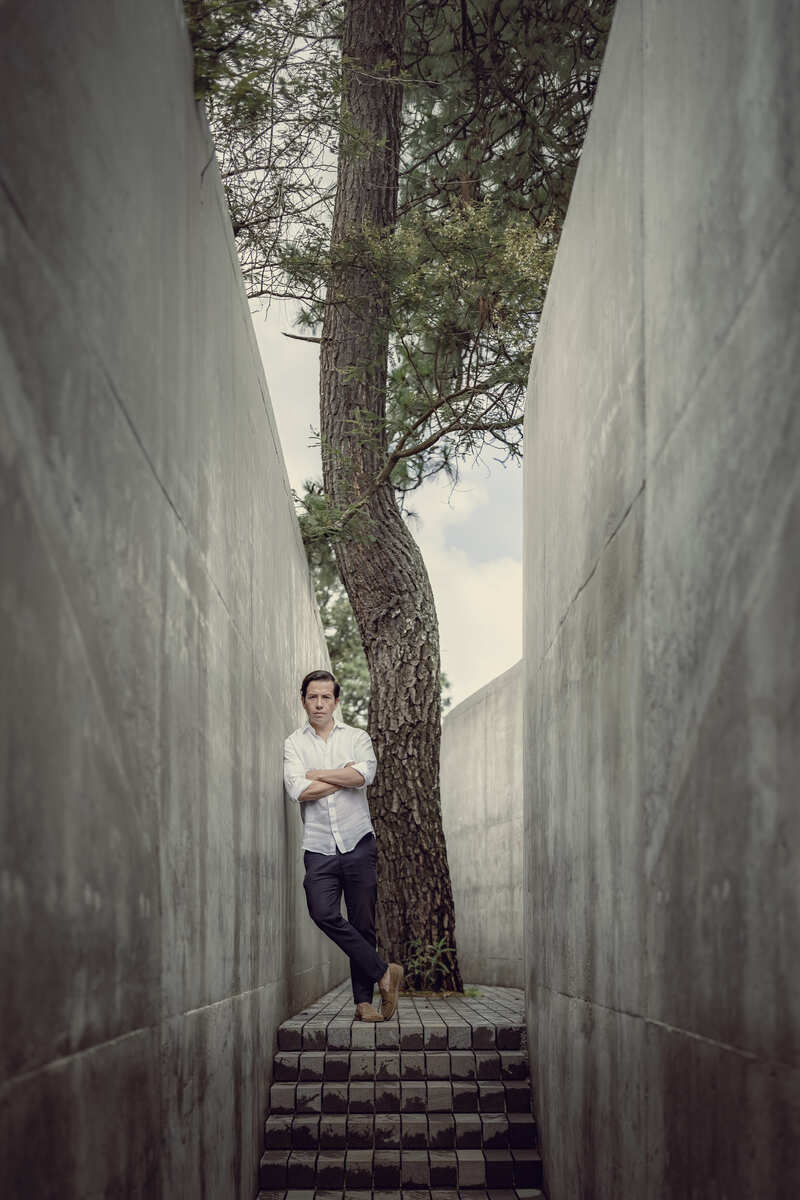
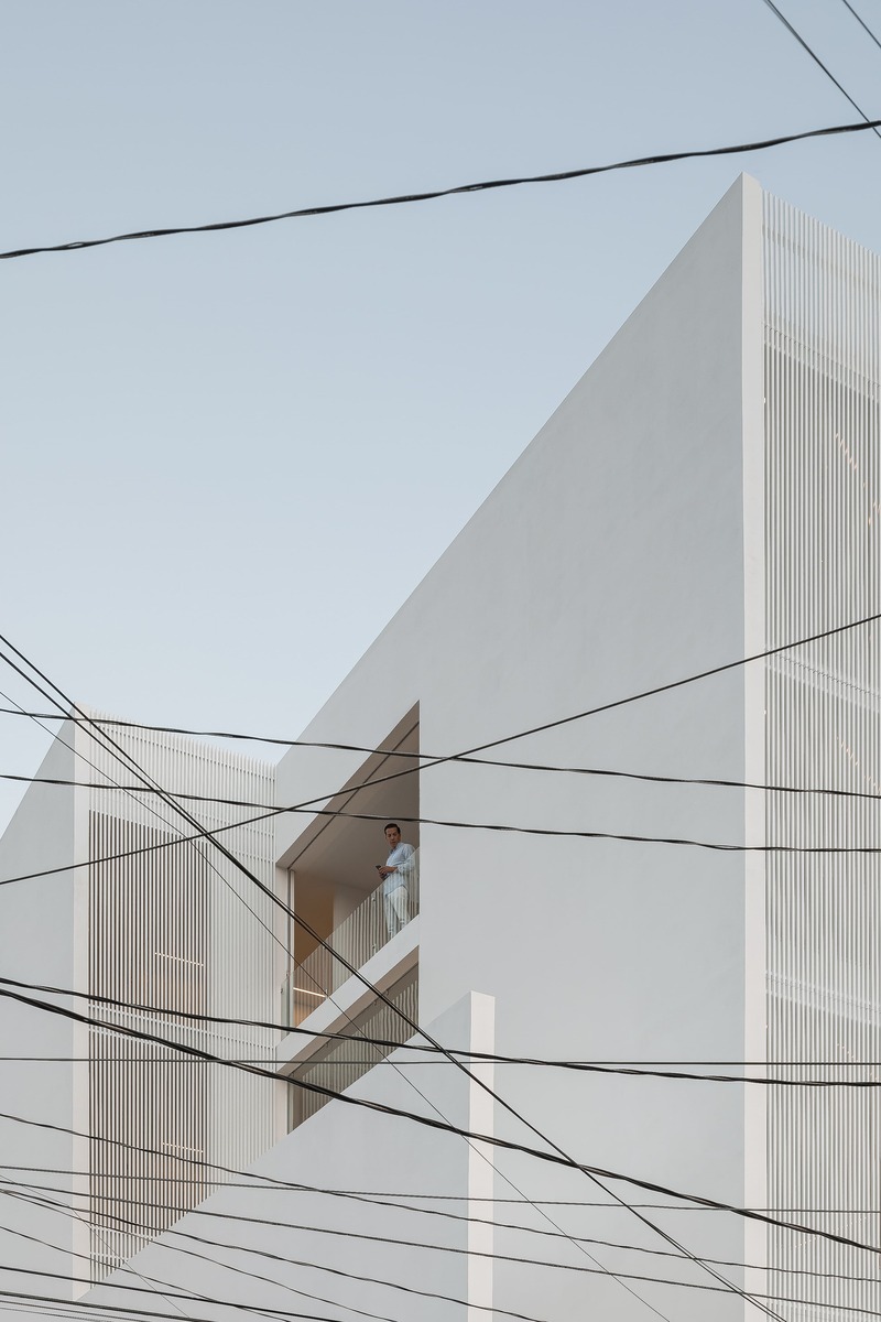
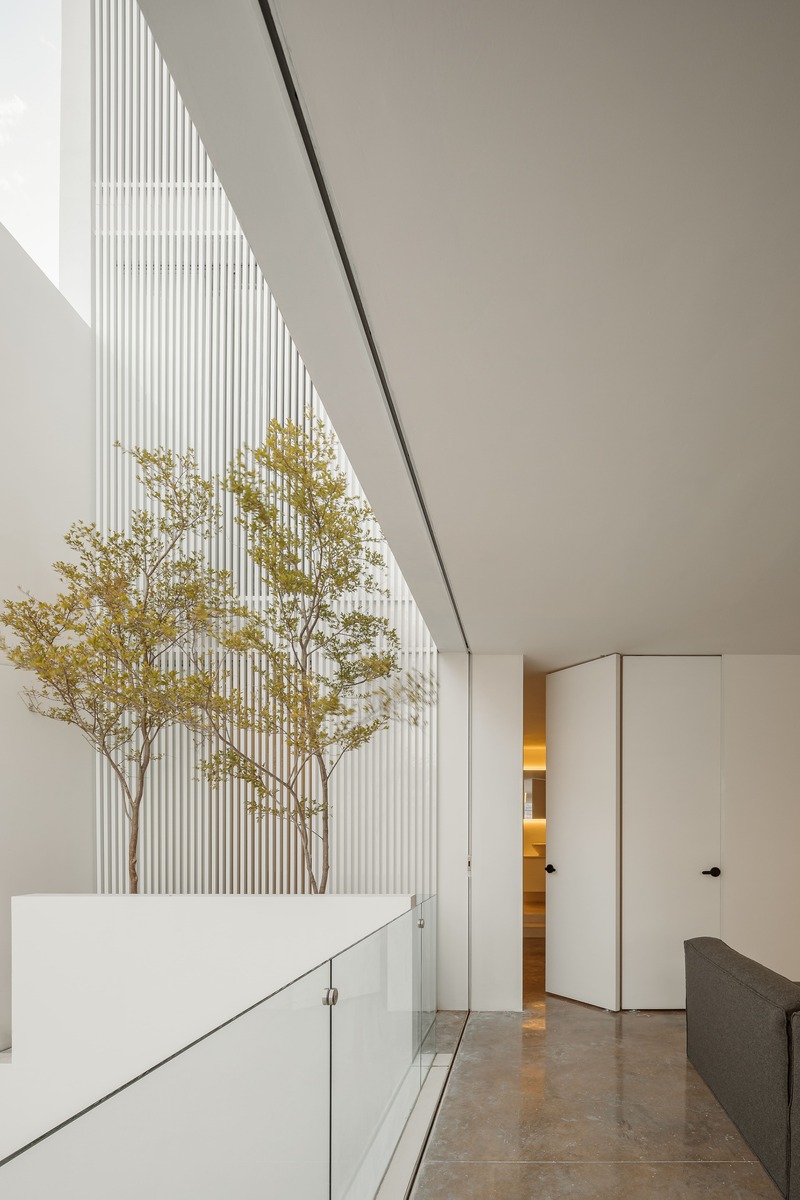
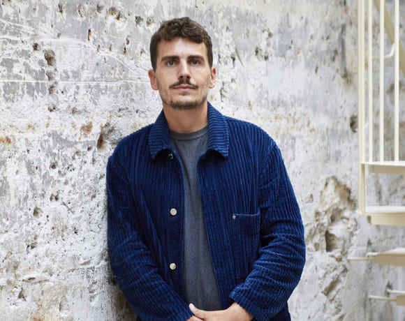
Rogelio Vallejo Bores founded HW Studio in Morelia in 2015. The workshop is complemented by the key participation of Vera Sánchez Macouzet, a professional psychologist. In his speech, Rogelio Vallejo Bores deeply reflects on the connection between Mexico’s emotional intensity and the architectural creativity that emerges from its context. The country’s cultural and artistic richness is nourished by life and death edges, significantly influencing architectural, literary, and artistic production. This duality translates into a unique methodology at HW Studio, where a deep understanding of the place, the inhabitant, and the architect are fundamental for each project. Vallejo Bores highlights the importance of understanding the personal stories of clients as a starting point. This is achieved through structured interviews and psychological analyses, guided by Vera Sánchez Macouzet, which help decipher the emotional and practical needs of those who will inhabit the designed spaces. This approach does not focus solely on superficial aesthetics but on creating environments that respond to the clients’ memories and life experiences. Additionally, Vallejo Bores emphasises the importance of balance and pause in architectural practice. This approach physically manifests itself in HW Studio’s premises, located in a natural setting in Santa María de Guido. From the entrance to the workspace, there is a sequence of emotions that invite clients to experience something beyond the conventional, contrasting with the surrounding urban chaos. Through specific examples of projects like The House with No Name and Casa Enzo, Rogelio illustrates how architecture can transform personal narratives into tangible spatial forms. These projects not only respond to physical needs but also aim to provoke deeper reflections on identity and personal meaning in relation to built space. HW Studio is distinguished by its holistic and human approach to architecture, combining emotional sensitivity, psychological analysis, and a deep respect for the history and context of the site. This method not only shapes physical structures but also enriches the lives of those who inhabit them, integrating Mexico’s cultural and emotional complexity into each of their works.
Interview realised with
RV: Roger Vallejo Bores | VS: Vera Sánchez Macouzet
A Dual Reality
RV: Sometimes I wonder what causes this high level of artistic, cultural, and architectural production. I believe it has to do with the extremities present in a country like Mexico. Namely, I think of an interview with Guillermo del Toro when he won an Oscar. A journalist asked him how a Mexican can talk about death and turn it into something so beautiful. Guillermo del Toro replied that when talking about life, it is impossible not to talk about death. Mexico has long been in a state of crisis; we have hit rock bottom and been reborn many times, experiencing both edges: life and death. Being in constant contact with these opposites is what contributes to the generation of such artistic, literary, and architectural production. Living between these opposites contributes to a high level of production in our discipline. For some reason, the most interesting periods of an artist correspond to the moments following a crisis. We are nothing more than a small part of what is happening culturally across the entire country. We are living in a period where there is overproduction in all sectors. I don’t necessarily see it as something positive. It is the result of a crisis not only in Mexico but on a global scale, namely, overconsumption. This overproduction has reached a country where it had never happened before. Evidently, we live a dual reality; architectural niches are created in juxtaposition to such conglomerates that produce architecture on a massive scale: studios like ours that seek the exact opposite. How? With limited production, trying to control quality and discourse, finding a way to balance. In these circumstances, it is necessary for both things to occur. This situation of overproduction will bring problems over time, but I would not dare to draw a conclusion just yet.
Between Pause and Reflection
VS: Something that constantly emerges in HW Studio’s discourse is the concept of pause and silence. I believe this is our way of responding to our Mexican context, which is a noisy environment full of contrasts. For us, seeking these pauses is something natural, and it helps us better understand our projects. Likewise, we try to translate these concepts through architectural design; we want to offer the inhabitant moments of pause and reflection in some projects, aiming to slow down an increasingly chaotic lifestyle. To create, we need to allow our brains to stop constantly chasing a goal. When the brain becomes obsessed with solving a problem without taking a break, it easily falls into a loop. If we don’t find the answer, we keep insisting without success. On the other hand, if we try to slow down, our brain is capable of generating solutions.
RV: For us, there are three fundamental variables in the development of an architectural project. The first one is the site. What does that place communicate to us? Our usual approach is to immerse ourselves in it like animals that inhabit it, with open senses, seeking to perceive beyond the tactile and the visual, through an immersive experience that permeates our being.
The second variable is the inhabitant: Who is this person? What is his or her story? What does he or she need? It’s not about imposing an aesthetic or creating a “great piece of architecture.” In our projects, we seek those moments of pause we talked about; if we propose using stone or concrete, or if a building is buried, it is not for aesthetic whim. It is about what the site communicates to us and a deep analysis of those who will occupy it. In this process, Vera helps us with a meticulous analysis to understand the needs of the people who collaborate with us. This analysis must be scientific; we cannot rely solely on our intuition. I have always been curious about other people’s stories and used to start this process of understanding as a friendship. Over time and with experience, we realised that we needed more of a quantitative approach.
The third variable, in addition to the site and the inhabitant, is oneself as a creator, as a designer. It is crucial to reflect on how we understand ourselves and where we are in our lives. In my case, this translates into a meditation technique where my goal is to create a pause: a pause in the discourse, in the constant monologue we hear, a search for silence and emptiness. I practice these pauses daily, and it is in these moments of assimilating all the acquired information that architecture begins to take shape. These are the three key variables we consider and that are present throughout the creative process that defines our projects.
Analysis Processes
VS: Our methodology, as Roger mentioned, emerged quite naturally. Encounters with clients initially generated a certain curiosity. We began to investigate how we could understand the identity of those who come to our studio. Once we understood it, we explored ways to translate this analysis into the development of an architectural project. We began to apply certain tests and defined a process consisting of different phases. During our meetings with clients, we conduct an interview with a pre-designed format, where we try to dig into the emotional history of a person with the site: what they remember, what they liked, what they didn’t like, how they felt... these conversations sometimes last several hours. Within that conversation, clients begin to find meaning in what they seek. We realised that many people are not entirely clear on what they want in terms of the project. They bring aesthetic ideas because they have seen spaces they liked, and they want to feel a certain way, but it is not well defined. As we move through the interview, clients begin to find answers. They begin to understand, for example, why they like a certain type of material, because it brings back childhood memories. It’s something that may seem obvious, but it’s not so easy to understand. Due to our conversations, we begin to understand the personality of each person. This is the first stage.
Secondly, standardised tests are applied. We use a personality test with greater scientific validity regarding personality traits. This test is useful to better understand the person and obtain important data. For instance, someone may respond better to concepts or to data. It is very interesting because it reveals that some people are more interested in project data, such as sustainability, consumption, efficiencies, etc., while others are more drawn to the conceptual side and want to be emotionally moved by the space. Additionally, some people have a high degree of "openness to experience" and seek greater stimulation and novel effects. This trait helps us design spaces that align with their expectations and needs.
Throughout this research process, it is important to condense all the information we receive to generate specific results. We arrive at very valuable details that help Roger in the development phase of the architectural project. In addition, the methodology we apply helps create a more intimate and direct relationship with the client. It was just an appointment in the beginning. Roger has a great skill for conversing with people. We gradually came to understand these skills and incorporated them into our work methodology.
Translating Memories into Spaces
RV: Our clients feel immersed in the design process. We worked with a couple a while back, and we understood that certain aspects of their personal lives could be reflected in the type of space they were seeking. He explained that he was forced as a child to painstakingly clean all the ornaments in the dining room cabinet, and he had to dismantle each piece, clean the base and the inside, and then reassemble and place them back. His wife had a similar experience; she told us that, as a child, she was put to clean the leaves of the plants they had in a patio. Through their experiences, they tried to communicate how crammed spaces, full of things and objects, brought back negative memories from their childhood. So, we landed a proposal for a clean and bold layout, where light and space were perceived avoiding those elements that could generate negative feelings that reminded them of bad times.
VS: We understood from their stories that they had an aversion to cluttered spaces, visual noise, and tasks like taking care of plants or spending a lot of time cleaning. We also understood that they were quite practical, determined, and uncomplicated people. When you understand these characteristics, it is easier to translate them into a built space.
RV: This process allows us to reduce friction between the proposal, the architect, and the client. It is more of a human approach, focused on what each person needs and how we can convey that through architectural language. We stay away from preferences because we understand that taste is temporary. One quality of architecture is mutation: taste changes over time. Often, we look at a photograph taken five years ago and no longer like what we see. We move away from taste to embrace personality and memories.
Sequence of Emotions
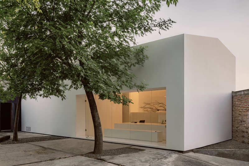
RV: Our office is located in Santa María de Guido, a pre-Hispanic village on the outskirts of Morelia. This place used to be a factory where Mr. Don Schumacher produced his furniture, quite iconic pieces of Mexican industrial design from the 20th century. Exactly where we have our office today, he dried the wood to make his pieces, which is why this office is called Kaji. Right where we have our office today, he dried the wood to make his pieces, so we named this office Kaji. Kaji is a Japanese word that means “place where fire is born.” Here is where the fire dried the wood, and here is where our fire is born.
From the moment a client steps into our office, they go through a sequence of emotions. We like to think of it as something similar to a melody. There is quite a bit of self-construction in this part of town; the buildings are many colours, the streets are half-finished, it’s a middle-class neighbourhood. Some of our clients are high-profile, so from the moment they approach our office, many wonder if they have come to the right place. They enter an area with factories surrounded by many trees that we planted when we first arrived here, and at the back of this forest and abandoned factory, they find a “white box,” which is our office. It is a sequence of situations that leads the client to have an out-of-the-ordinary experience. Upon arriving at the office, we ask them to do something unconventional in Mexico: take off their shoes. This gives us a preliminary understanding of each person’s characteristics. Some take them off without much questioning, considering it just another anomaly in this sequence of affairs. By taking off their shoes, they unconsciously remove a barrier too and move at a different pace. In Mexico, you normally take off your shoes before going to bed. This gesture is as if we were recreating a state of peace. We try to lower the client’s defenses a bit, to make them a little more vulnerable, all in a very genuine way. This simple action also reveals a lot about a person; those who do not want to take off their shoes may have a more rigid personality. It is a fact that allows us to understand that the approach to the project should probably be very practical. These small details provide compositional arguments to generate a piece that suits each type of person.
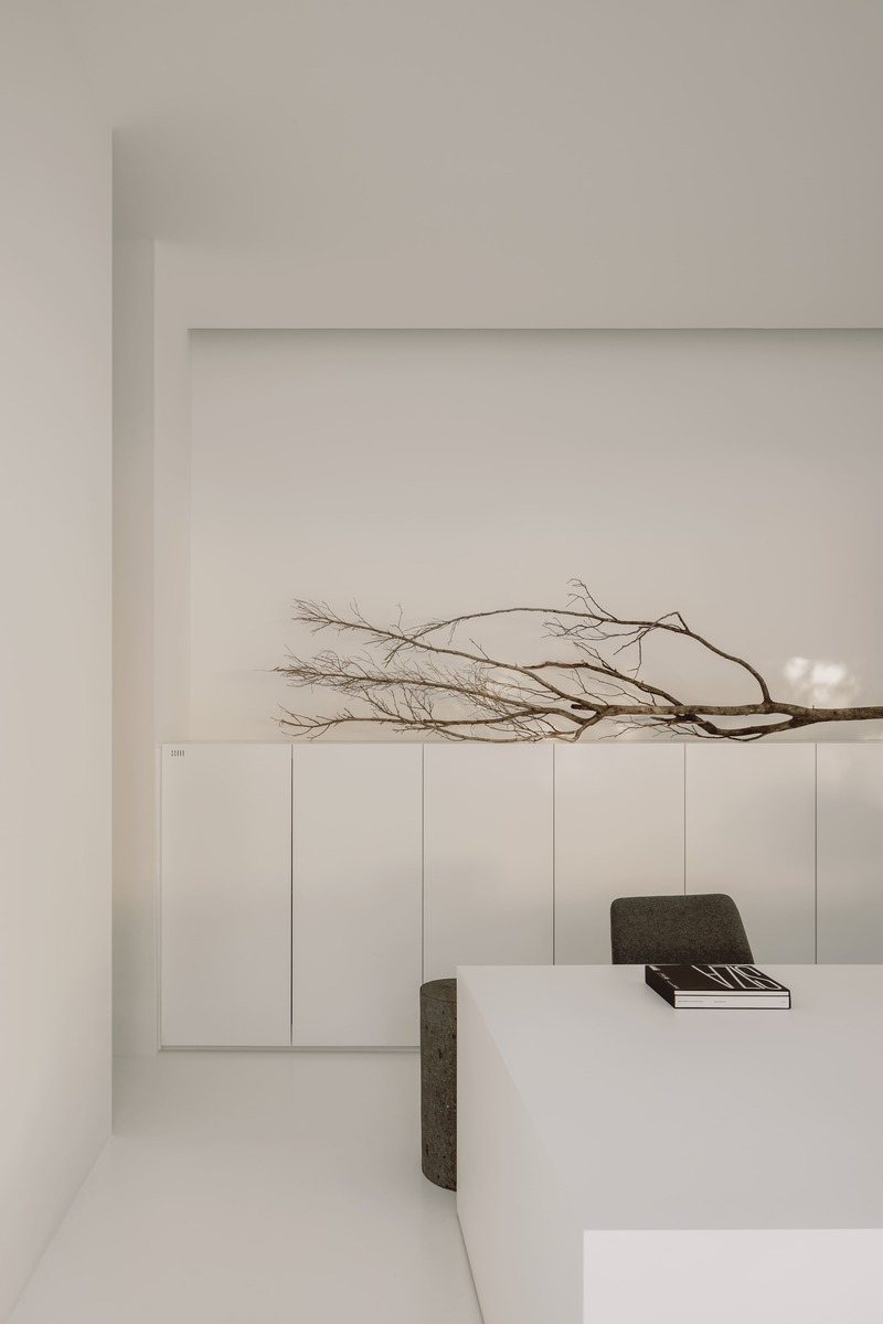
The workspace is divided into two areas: the first is where the work is done rather manually with models and computers. We have a full view of the factory and the forest from here. The second area has very few windows; the only lighting comes from the sky, as it is more of a more conceptual space where we address clients and avoid distractions. The natural light coming through the sky softens the atmosphere, making it more welcoming. This is where we usually have tea.
A Human Approach
RV: One of our first clients was a Secretary of State during Felipe Calderón’s government. He asked us to design his home in Morelia. It was quite an unusual assignment since one normally starts with more modest projects, like remodelling “your aunt’s bathroom.” At that time, I didn’t have any completed projects. I met him at a meal and, upon finding out I was an architect, he asked me to send him my student portfolio. Something appealed to him, and he commissioned me to design his house. I was living in Barcelona at that moment and didn’t feel prepared for such an important endeavour. Almost hoping for him to change his mind, I accepted the assignment asking for full creative freedom. It was truly overwhelming with a one million dollar budget. The first thing I did was try to understand the person. At the time, the government was about to start the war on drug trafficking, a very serious situation. I knew this man would face very tough years. He played a lot of video games as his way of unwinding. Since that first project, I tried to understand the human being and what he was requesting from me. This way of approaching clients remains to this day. His house is organised around a forest that we planted in the center of the plot. This is common in many houses found in Morelia, inspired by the typical Spanish colonial house that is organised around a central courtyard. Before starting construction, we decided to plant this forest as the central element of his home. Almost like a filter, we wanted this man to pass through the forest to get home. It was our conceptual interpretation of his personal moment, the beginning of a new life. Additionally, we designed another way to access his house: through a narrow hallway where we decided to reduce the height, so he would feel the need to stoop to get in. We believed that this client, who operated in high spheres of power, had a strong ego. That is why we designed a narrow entrance, inspired by Japanese tea rooms, with small doors that require bending down before entering. This choice symbolically aimed to invite the client to set aside his ego before entering the new space, aspiring to be a better person inside.
Later, we received a second equally unusual assignment; we were requested a house, and we had in mind working with courtyards at that moment. This approach was “tattooed” on me as I used to live in a 16th-century house downtown Morelia. Almost all houses there are organised around courtyards, so this client told us that he liked our proposal although he did not want courtyards. He wanted us to build on the entire plot, leaving only 20% for courtyards. We decided to cover everything as he wished, dividing the courtyard into many empty spaces where we placed trees across the deck. Thus, we managed to satisfy his wishes while maintaining our vision. These two examples summarise part of our methodology, which focuses on understanding the human being behind the client. Over time, our methodology has not changed, but has been further refined.
Volumes, curves, voids
RV: Interestingly, the presence of curved lines is gaining prominence in our work. As we move forward, straight lines seem to take a back seat. I’m unsure if this occurs naturally as we develop greater skill in this resource. I also notice how emptiness becomes more forceful and evident in our designs. A Basque sculptor who intrigues me greatly is Jorge Oteiza, known for his rivalry with Eduardo Chillida. At a critical juncture in his career, Oteiza sought to incorporate evidence of action into his works. He observed a girl eating an apple and noticed how biting into it created space while marking the action performed. This concept gradually took shape in Oteiza’s sculptures, which increasingly become empty to the extent that space seems to devour everything. It was then that Oteiza decided to abandon sculpture to devote himself to teaching, acknowledging the preeminence of emptiness in his work. The stereotomy he developed in his works becomes increasingly evident in the architecture we perform, where emptiness plays a fundamental role. It isn’t something tangible or explicit from the outside but a characteristic emerging just the way we like to work with volume and its relationship with subtractive space.
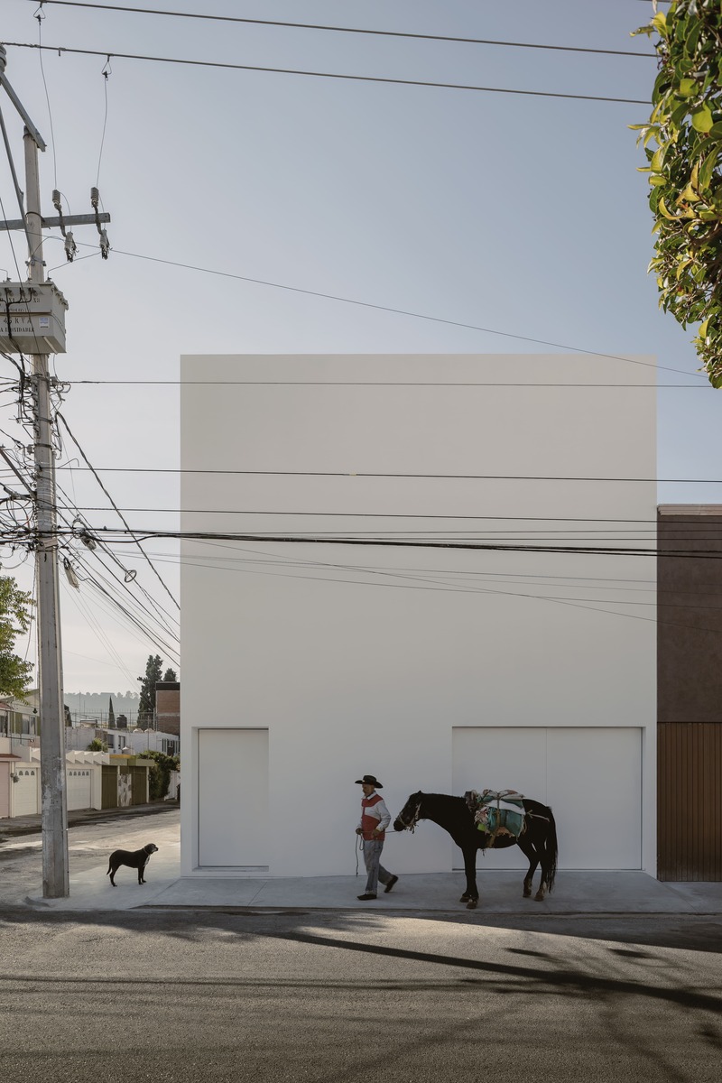
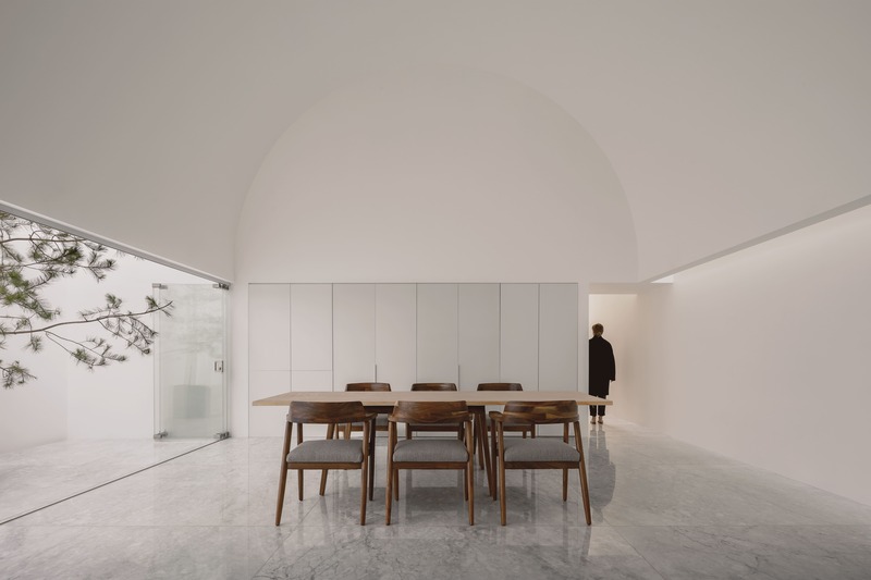
The House with No Name exemplifies this concept in a remarkable way. It arose from a traumatic experience; the owners were victims of a robbery and, for security reasons, requested that the house have no windows facing outside for fear of a recurrence. With an empty plot at their disposal, they desired a residence with high walls that would provide refuge. We responded to this need with an airtight proposal: a white cube. From our perspective, it was essential to have the excavation done from the inside to provide adequate light and ventilation to the area. Given their religious fervor, we decided to link their spirituality with the shape of the ceilings, which they wanted high. We designed barrel vaults by delving into this dense and solid material. The house clearly reflects this stereotomic process, drawing inspiration from Oteiza’s work.
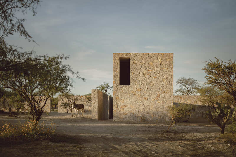
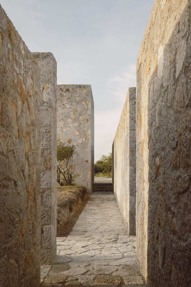
For the stone-built Casa Enzo, we adopted a completely different approach. Located in a vast desert plain with a mountain in the background and an extremely hot climate, our architectural proposal focused on creating a cross that divides the space into four distinct quadrants. The first quadrant was designated for an endemic garden, while the second quadrant was reserved for parking, strategically located in the least wooded area and protected by tall trees that act as natural sunshades. The third quadrant harbours an office area, and the fourth quadrant is intended for the main house. The project’s goal was to design several stone pathways accompanied by thick walls that provide shade and help mitigate the arid climate of the region.
Questioning the Mexican Style
RV: I have questioned quite a lot the alleged lack of “mexicanness” in our proposals. We have often been criticised for being considered not so “Mexican,” whether due to the absence of color, choice of materials, among other aspects. I wonder if nationalities actually exist when we talk about fundamental elements like light and space. I believe that good architecture, from Palladio to Siza, is distinguished by a proper mastery of these two elements. It becomes irrelevant whether it is quarry or it is pink or red brick. The crucial point lies in the sensations that a correct handling of such elements can generate. In this vein, our references tend to be more philosophical. For instance, Casa Enzo is completely “miesian,” while the Hill in Front of the Glen is inspired by Tadao Ando’s line. Our approach does not aim to create a defined style. When we take on a project, our interest lies in solving it in the best possible way, using the most appropriate architectural language to address specific issues and contexts. I question the cliché idea of what is considered Mexican style. For us, painting a wall pink or using specific types of tiles or wood, when we no longer have many forests to produce wood or textiles, seems to stem more from a Mexican cliché than from a genuine understanding of the rich contrasts that characterise Mexico.
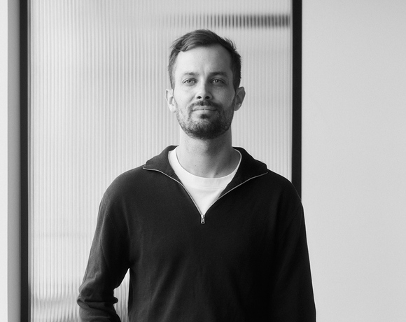
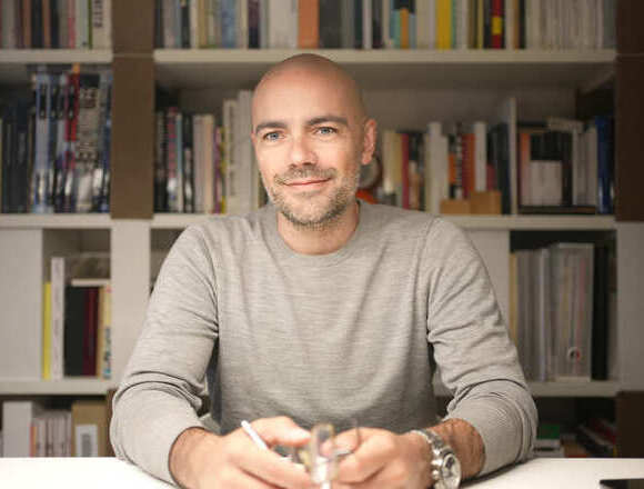
➡️ Rogelio Vallejo Bores, Portrait in Casa Morelia. Courtesy of HW Studio
➡️ Kaji, HW Office. Photo credits: Cesar Bejar
➡️ Kaji, HW Office. Interior view. Photo credits: Cesar Bejar
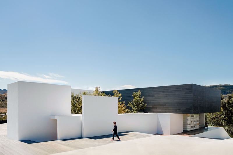
➡️ MK House. Exterior view. Photo credits: NOME FILMES
➡️ Unnamed house, Casa sin Nombre. Exterior view. Photo credits: Cesar Bejar
➡️ Unnamed house, Casa sin Nombre. Interior view. Photo credits: Cesar Bejar
➡️ Enso House, Exterior view. Photo credits: Cesar Bejar
➡️ Enso House. Photo credits: Cesar Bejar
➡️ Ai Department tower, Exterior view. Photo credits: Dane Alonso
➡️ Ai Department tower, Interior view. Photo credits: Dane Alonso